Lisa Renault Photography
mercredi 24 novembre 2010
mercredi 10 novembre 2010
Assignment 4| Industrial Photograph Pre-Light diagram & photo
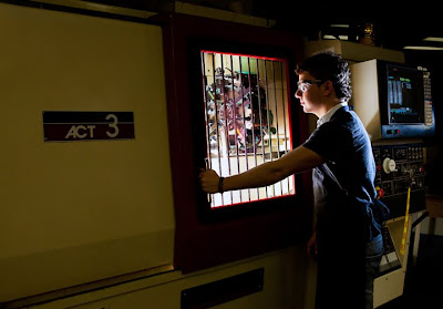
For this assignment, we want to mix various types of lights. We would like to keep the tungsten and fluorescent lights which are inside the machine (that we can see behind the window), close the lights of the room, and add others sources to light the model and some details of the machine.
We will light the model with a strip soft box in order to re-create the effect of the light coming from behind the window. Then, we will add speedlites to enhance some details of the machine. We are probably going to use multiple exposures to have everything lit correctly : the window of the machine, the model, and some details on the machine.
We will try to do that for both compositions if we have two models. Our aim is to use a fast enough shutter speed to be able to control the light on the subject and make the background darker. We will also try to add a strobe bouncing on the ceiling behind the machine to try to make the machine looks more powerful.
The hardest thing to take care of will probably be the window. First, we will have to ask the student to clean it so we won't see all the dust in the photograph. Then, we are going to use a polarizing filter to avoid reflections on it.
dimanche 31 octobre 2010
dimanche 24 octobre 2010
Assignment#2 | Lighting test
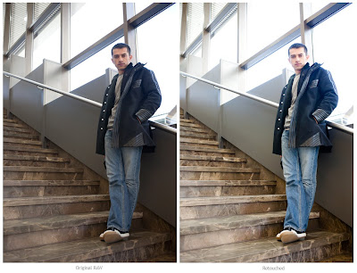
Digi Polaroid 1 | Plan A with natural light only
Digi Polaroid 2 | Plan A with one light added
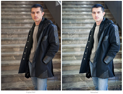
Digi Polaroid 3 | Plan B with natural light only
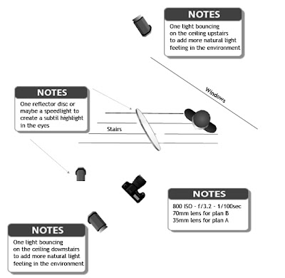
pre-light diagram
Camera settings - Digi Polaroid 1 : 800 ISO | 1/30s @ f/3.2 | 35mm lens
Camera settings - Digi Polaroid 2 : 800 ISO | 1/100s @ f/5.6 | 35mm lens
Camera settings - Digi Polaroid 3 : 800 ISO | 1/30s @ f/3.2 | 70mm lens
For this assignment, we tried with michael to both find two nice places that could be interesting for our final photo. The one called Plan A is my favorite, but it includes windows and first, we will be shooting in the morning so the light won't be the same next time, and, we don't know what the weather will look like. That's why we thought about a "Plan B". In my case, I will do the shoot in the stairs of the lobby, without including any window. This is safer in order to have a good shot even if the weather is bad because it actually excludes the outside environment.
Anyways, I really like both of these two compositions that were shot in the same place actually so I think I will try both if we have the time. This way, I will have more options to choose what is the best place to enhance my model.
To imitate the natural light in the environment and increase its power, we will probably use two white lightnings by bouncing them on the high ceilings.
Plus, we can see on these three digi-polaroids that a highlight in the eyes is missing so we are going to bring different smaller light sources such as a reflector disc, or a speedlight to add a bit of kick to the photo.
My model is a real state agent. As she is propably going to wear black clothes, I'll be carefull to keep details in the blacks. I asked her to be professionaly dressed as when she receives clients and to bring an agenda or someting she often uses to have an accessory just in case we would like to add something in the shot.
Location Kit needed :
- 1 camera + memory cards
- 1 24-70mm lens
- 2 x 1600 white lightings
- 1 vagabond battery
- Extension cords
- 1 Powerbar
- 1 reflector disc
- 1 diffuser
- 1 polarizing filter to avoid reflections on the windows if necessary
- 1 speedlight
- 3 stands
- Pocket Wizards
- 1 laptop + a cable to shoot tethered
- 1 grey card
vendredi 15 octobre 2010
Midterm Assessment : Product Shot on Location - Part 2
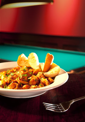
For the final shot, we decided to use different types of lights. We kept the available light for the background, and we turned on the lamp that was on the left side of our product to add a bit of mood in our shot.
We mainly used a modeling light with barndoors on the right of our product to enlight the tortellinis, and we added a third light with a snoot at the back of the product to give more punch to it.
Then, we played with a polarizing filter to avoid the reflection created by the plate on the table.
We shot the product having in mind that we would flip the image after in photoshop, to be able to keep a nice composition with enough space to see the writing properly on the layout.
So, that's what I did when I edited the image in Photoshop, I first flipped the image, cleaned the table a bit and adjusted the white balance.
However, the colors of the fonts should be changed to facilitate the reading; probably by writing the red words in green and the black ones in white.
That was an interesting experience!
mercredi 6 octobre 2010
Midterm Assessment : Product Shot on Location - Part 1
As we can see on the digi polaroid, the available light creates a nice mood in the photo. The only thing is that the product is not light enought to be emphasized. So we will add a light specialy for the product and leave the background with its ambiance light.
We will leave a bit of extra space in the frame, to permit to the graphic designer to crop the photo as he wants. It's pretty easy in this composition to crop a bit of the light that is in the background, and also a part of the table that supports the plate.
We can see in the digi palaroid with layout, that there is enough place to put the name of the magazine at the top, and be able to see the rest of the text on the left and right of the plate. Colors of font should be probably changed to be able to see them more on this darker background.
jeudi 30 septembre 2010
Assignment 1| Final Image and Lighting Diagram
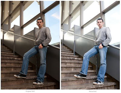
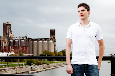 Retouched image
Strobe exposure : 100 ISO | 1/200 @ f/11.0
Camera settings : 100 ISO | 1/200 @ f/7.1
Camera settings : 100 ISO | 1/200 @ f/7.1
To shoot this final image, I used the same setting I had for the lighting test, except the reflector disc to block the sun. This time I used it as a diffusion panel to diffuse my flash light instead of using the umbrella which was impossible to keep open because of the wind!
The good thing was that there were clouds in the sky, as in my inspirational photo. The complicated thing was the perpetual changes in the sky with the sun coming in and out all the time! So I had to wait the good moment and shoot fast.
I still had to add some color in the sky, and make a warmer light on my model in Photoshop, to recreate the mood of my inspirational photo.
Inscription à :
Commentaires (Atom)


